Heem
Objective
Design an app that allows users to view a catalog of furniture and place it in their home via AR.
Heem is a new app for interior design and they have partnerships with a number of top 10 furniture stores in the U.S. They are currently scanning all the catalog items featured by these stores, as well as setting up processes to keep their catalogs updated. Besides being able to browse through the catalog and order anything online through their app, users can also see their desired furniture where it would be placed in their home via augmented reality on their smartphones or tablets.
Research
Augmented reality (AR) is becoming increasingly popular, but there are many who haven't experienced an AR app before. I created research goals to learn about the current furniture purchasing market and what issues can best be solved with AR.
My main research goals:
Learn about the existing furniture purchasing trends and furniture AR apps
Understand what people are interested in when looking for furniture
Learn about the current advantages and disadvantages of shopping for furniture online
Research Findings
Competitive Analysis
There are a lot of emerging apps in this space, and many competitors put an emphasis on interior design. I found that most of furniture shopping is still done in stores because people want to see the size and textures of the furniture before purchasing.
User Interviews
Through the user interviews I found the most common themes regarding furniture purchasing were
Browsing - online to narrow down their options before going in store to take a look at the textures and quality of the furniture
Viewing in Store - after seeing what options they had they still wanted to go to see the item in person before purchasing
Customer Service - if they have questions about the products or delivery the workers tend to be more knowledgeable for something like furniture
Price - they check for the item online before purchasing because the price tends to be cheaper online
Interaction Design
User Flow
Based on the persona I created a typical user flow for someone looking to view a piece in their space and then purchase a piece of furniture.
App Map
I created an app map based on the most important features I found while conducting research.
Sketches and Wireframes
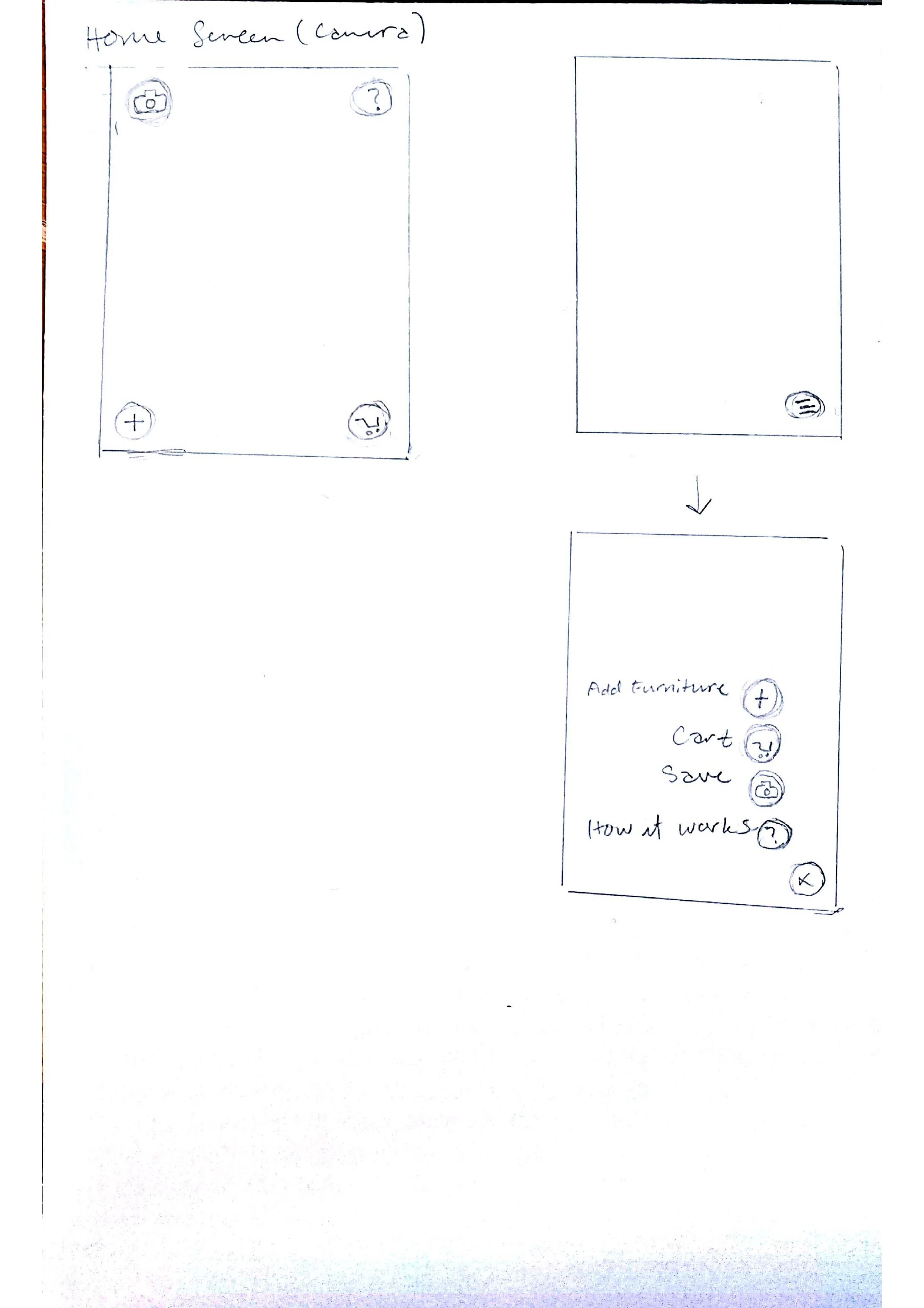
Initial sketches were developed based on the user flow and app map. Then low fidelity wireframes were created based on the sketches.
Branding
The target market of Heem is someone looking for new furniture, they are looking for furniture that matches their existing pieces. They care about aesthetics and how the pieces fit with their space. I thought the branding of Heem should be minimal and sleek as not to distract from their goals of finding the perfect piece for their space.
The app has a lot of colorful images. Because the main interface is camera, the visual of the home screen is unpredictable since it is dependent on where the user is pointing the camera. For these reasons I kept the color palette neutral so the UI would not distract from the content.
Increased Fidelity
From the wireframes I increased the fidelity of the wireframes to create a testable prototype.
Usability Testing
I created a prototype to test the main user flow of searching for a piece of furniture and observing how it looks in a room. I tested the two main tasks, finding a dresser and adding it to the space, and navigating the different AR features in the app.
The main objectives for the test:
Evaluate the navigation and flow of searching for the items
Observe the expectations of the AR function, if the design matches them or how they can be improved
Observe possible problems or hesitations with the experience
Confirm the overall flow and functionality aligns with the user’s expectations
Test Results
The testing of adding the dresser to the space
Every user was able to go through the userflow easily.
The main screen buttons were self explanatory to all the participants.
One participant expressed the desire to filter and sort the different dressers.
Testing the AR features
All participants expressed the desire to rotate the item.
The participants could not tell what the details button did.
One participant could not tell if the items were added to their cart or not after adding the dresser to their space.
One also noticed the lack of company branding.
Affinity Map
Potential Solutions
In order to solve the problems faced during usability testing I came up with some potential solutions.
1. Lack of Branding
I added a loading screen before the home page that shows the company name and branding
2. Inability to sort furniture
On the page with the dressers I added filter and sort by buttons
3. Unclear Button Function
When moving the furniture around the room I changed the details button to an i to represent information.
4. Action Lacking Feedback
When an item was added to the space, and to the cart I changed the shopping cart icon to count the number of items that have been added.
5. Incomplete Information at Checkout
I also added a quantity to the items at checkout.


